Notice»

Recent Post»

Recent Comment»

Recent Trackback»

Archive»

« 2024/3 »
1 2
3 4 5 6 7 8 9
10 11 12 13 14 15 16
17 18 19 20 21 22 23
24 25 26 27 28 29 30
31


30 Awesome Web Designs That Create an Illusion of Depth

Creativity | 2011. 5. 13. 20:59 | Posted by 스마트 안전보건

30 Awesome Web Designs That Create an Illusion of Depth

Depth perception is our ability to see the world in three dimensions. It allows us to gauge the relative distances of objects we can see. In a plane/2D surface, depth can be simulated by the use of concepts related to depth of field, perspective, focal/vantage point, shading, lighting, and others.


Web design is traditionally a two-dimensional medium. However, experimenting with faux 3D effects can lead to interesting and memorable user experiences. In this showcase, I present to you web designs that successfully create an illusion of depth.

The Pixel

Perspective is a concept you can use for creating a sense of depth, as can be seen in The Pixel website.

Ecoda Zoo

In this web design, visitors are confronted with various interesting animation effects. By holding down the mouse button, users are able to navigate through the three-dimensional scene.

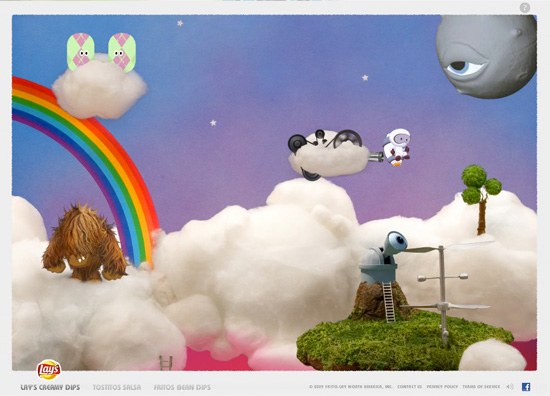
Frito Lay

Frito Lay’s website uses perspective to give the viewer the impression that they are in a three-dimensional environment. Colorful character animations and shading further reinforce the 3D theme of the site.

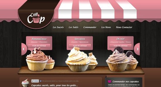
Cup Cup

In this website for a cupcake shop, depth is achieved through the use of an awning (among other things), making it appear as though you’re looking at a storefront displaying cupcakes. The cupcakes are placed in such a way as to give them the appearance of sitting on top of a shelf.

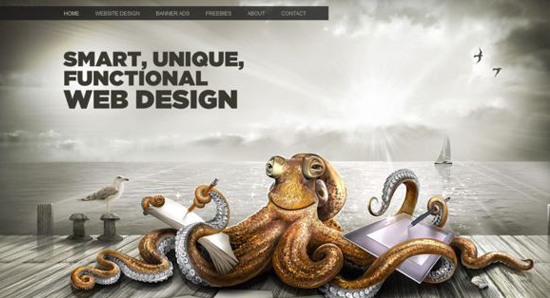
WebDesignbe.com

Through the use of perspective, depth is achieved on WebdesignBe.com. An almost photorealistic illustration of an octopus further exemplifies the three-dimensional characteristic being portrayed on the site.

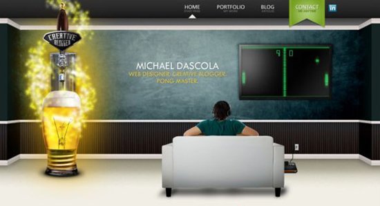
Mike Drascola

The portfolio website of web designer Mike Drascola establishes an illusion of depth. A surreal quality characterizes the three-dimensional scene presented on the site.

Gardener & Marks

Gardener & Marks creates a photorealistic setting that seems to embody the company’s style. Depth is attained through various mechanisms, including the use of shadows on objects.

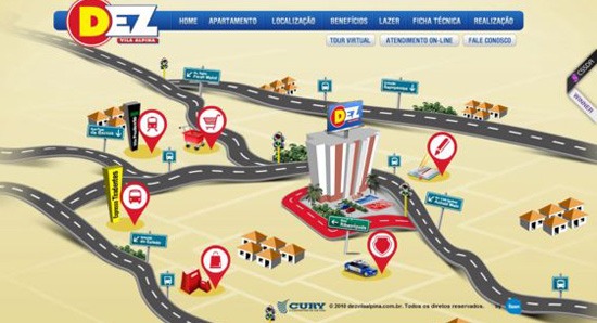
Dez Vila Aplina

Dez Vila Aplina uses perspective in their illustrated roadmap. Shadows are another technique used to portray depth in this design.

Versions App

Visual depth is achieved on this website through the use of a landscape, lighting, and shadows. The color palette also helps support a 3D look-and-feel.

The Dascola Barbers

The Dascala Barbers website pays homage to Ann Arbor, while focusing on the people that make the shop a success. A figure/ground perspective is achieved through the caricatures of the barbers.

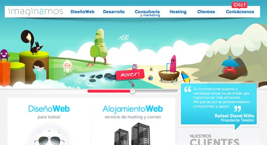
Imaginamos

On the Imaginamos site, depth is simulated in the illustrative header through the appropriate scaling of objects.

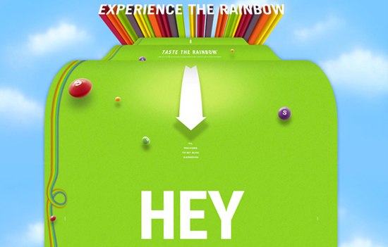
Skittles

Through the use of a large scrolling rainbow that protrudes from the background, Skittles gives the viewer a glimpse into the company and its history. Viewers are engaged into a unique interactive experience when they visit the site.

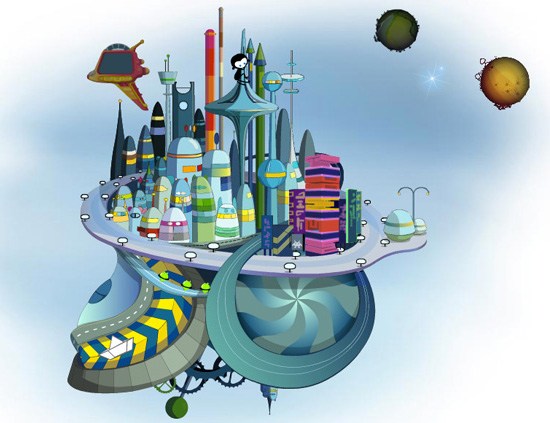
Plantate

This fun website features a rotatable, 3D planet underscored by well-placed shadows and layering to create the illusion of depth.

Adobe Creative Suite 3

A surreal 3D illustration gives the Adobe Creative Suite 3 website an otherworldly character.

Iceberg Quest

Great composition produces an interesting landscape that’s used as the background and a central design element on the Iceberg Quest website.

Wing Cheng

Wing Cheng is a designer whose portfolio site establishes an illusion of depth. By unfolding the pages, you get a real-life look into the work of the designer. Shadowing helps give the elements a 3D appearance.

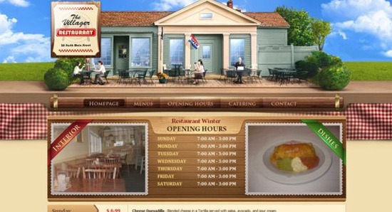
The Villager Restaurant and Catering

This website features a wonderful illustrative header that simulates depth. Depth is used as a functional tool to create visual hierarchy by attempting to focus your attention on the navigation menu bar after you view the beautiful illustration of the restaurant’s exterior.

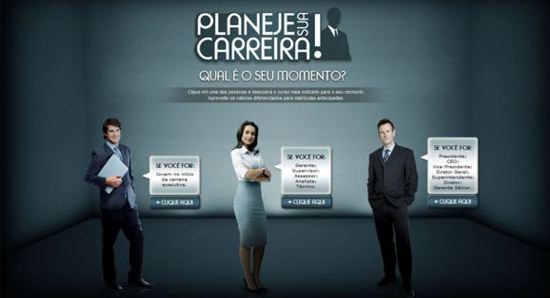
Planeje Sua Carreira

Site visitors are greeted by a faux 3D environment when they go to the Planeje Sua Carreira website.

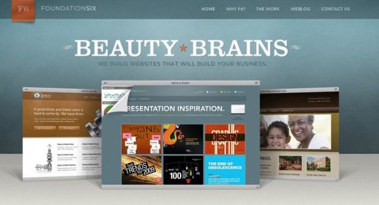
Foundation Six Web Design Studio

The website designs by Foundation Six take center stage in this portfolio website. The illusion of depth is created by the use of shadows, layering, and object scaling.

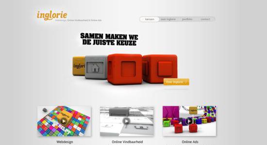
Inglorie

The Inglorie website gives you a sense of depth through the use of perspective and shadowing. The 3D effect, coupled with animation and the use of distinction techniques, draws your attention to the objects at the center of the screen.

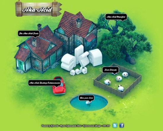
Aka-Acid

An aerial/bird’s-eye view of a house creates a sense of depth for the Aka-Acid site. Shading also adds to the illusion of depth.

Green Woods Country Club

By using a natural landscape and perspective, the Green Woods Country Club website creates an almost realistic scene.

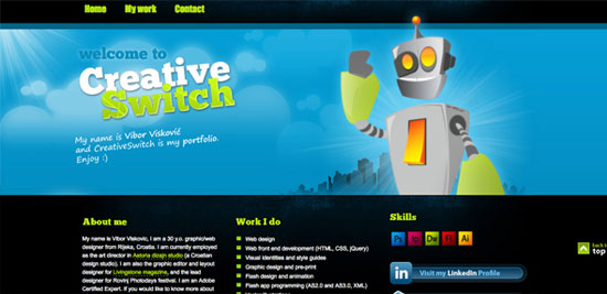
Creative Switch

Creative Switch achieves depth through the use of scaling, which brings the mascot to the front as the city landscape fades into the background. Darker colors also help the background fade into the distance.

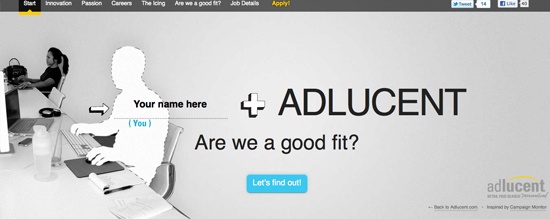
Adlucent

Depth is achieved by using perspective in the photograph that is a central design piece in this website.

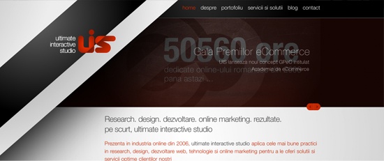
UIS- Ultimate Interactive Studio

The Interactive Studio UIS website creates depth by layering and by using shadows.

Help Scout

The Help Scout website uses depth of field, as can be seen by the birds being blurred to create an illusion of distance.

Hippo App

By using colorful, bright illustrations and perspective techniques, the Hippo App website achieves a nice simulation of depth.

Dino Yul

This unique website by Dino Yul creates an illusion of depth in the layout’s central element, the image slideshow. Shadows and layering bring the image slideshow to a higher plane.

Zennaware

Through the use of shadows, depth is conveyed masterfully on Zennaware. Objects look like they’re resting on top of a table.

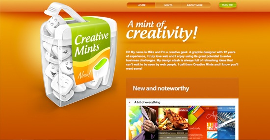
Creative Mints

Colorful and creative illustrations take center stage on the Creative Mints website. Once again, we can see how the use of shadows and proper scaling of objects can be used to establish a sense of depth.

Source: sixrevisions.com

:

Overview of AR instruction site

Education | 2011. 4. 23. 22:46 | Posted by 스마트 안전보건

These are overviews of AR instruction site, my final project of instructional design class.

1. Concept map of the marketing problems in Busitco

The_problems_of_b_marketing_in_Busitco


2. Concept map of AR instruction siteLayout_of_AR_site.png

이 글은 스프링노트에서 작성되었습니다.

:

Helvetica is everywhere in life

Education | 2011. 4. 23. 21:16 | Posted by 스마트 안전보건

About the film 'Helvetica'

Helvetica is one of fonts or typefaces and is also a documentary movie about typeface 'Helvetica'

Helvetica is a feature-length independent film about typography, graphic design and global visual culture. It looks at the proliferation of one typeface (which celebrated its 50th birthday in 2007) as part of a larger conversation about the way type affects our lives. The film is an exploration of urban spaces in major cities and the type that inhabits them, and a fluid discussion with renowned designers about their work, the creative process, and the choices and aesthetics behind their use of type.

cover.spiekermann480.jpg

remotesnap000040.jpg

Helvetica encompasses the worlds of design, advertising, psychology, and communication, and invites us to take a second look at the thousands of words we see every day. The film was shot in high-definition on location in the United States, England, the Netherlands, Germany, Switzerland, France and Belgium.

Interviewees in Helvetica include some of the most illustrious and innovative names in the design world, including Erik Spiekermann, Matthew Carter, Massimo Vignelli, Wim Crouwel, Hermann Zapf, Neville Brody, Stefan Sagmeister, Michael Bierut, David Carson, Paula Scher, Jonathan Hoefler, Tobias Frere-Jones, Experimental Jetset, Michael C. Place, Norm, Alfred Hoffmann, Mike Parker, Bruno Steinert, Otmar Hoefer, Leslie Savan, Rick Poynor, and Lars Müller.

remotesnap000043.jpg

remotesnap000045.jpg

Helvetica had its World Premiere at the South by Southwest Film Festival in March 2007. The film subsequently toured film festivals, special events, and art house cinemas worldwide, playing in over 300 cities in 40 countries. It received its television premiere on BBC1 in November 2007, and will be broadcast on PBS as part of the Emmy award-winning series Independent Lens in fall 2008. The film was nominated for a 2008 Independent Spirit Award in the "Truer Than Fiction" category, and was shortlisted for the Design Museum London's "Designs of the Year" Award. An excerpt of the film was included in an exhibition at the Museum of Modern Art in New York.

About typeface

Helvetica was developed by Max Miedinger with Edüard Hoffmann in 1957 for the Haas Type Foundry in Münchenstein, Switzerland. In the late 1950s, the European design world saw a revival of older sans-serif typefaces such as the German face Akzidenz Grotesk. Haas' director Hoffmann commissioned Miedinger, a former employee and freelance designer, to draw an updated sans-serif typeface to add to their line. The result was called Neue Haas Grotesk, but its name was later changed to Helvetica, derived from Helvetia, the Latin name for Switzerland, when Haas' German parent companies Stempel and Linotype began marketing the font internationally in 1961.

remotesnap000047.jpg

remotesnap000049.jpg
Introduced amidst a wave of popularity of Swiss design, and fueled by advertising agencies selling this new design style to their clients, Helvetica quickly appeared in corporate logos, signage for transportation systems, fine art prints, and myriad other uses worldwide. Inclusion of the font in home computer systems such as the Apple Macintosh in 1984 only further cemented its ubiquity.

Some key comments in the movie 'Helvetica'

Typefaces express the mood and the atmosphere.
Helvetica is ubiquitous, we can see it everywhere.
The designer has enormous reponsibilities.
CI of American Airline has not been changed for 40 years.
Don't use more than 3 typefaces.
Helvetica is the modern type and has a great legibility.
After world war II, there is a idealism, Design was the part of that and should be more democratic, social reponsibility
Helvetica emerged in 1957 and there was the need for rationality, where can be applied to all kinds of information
Design should be clear, real, and straightforward.
Helvetica is all about interrelationship of the negative shapes, the figure-ground relationship, shapes between characters and within characters.
Helvetica are letters that live in powerful matrix of surrounding spaces.
Helvetia is the Latin name of Switzerland
Neutral, effective, accessible, transparent, accountable are features of Helvetica.

Some Trailer Clips of Helvetica

이 글은 스프링노트에서 작성되었습니다.

:

Elements of objectives_학습목표

Education | 2011. 4. 12. 10:10 | Posted by 스마트 안전보건

These pictures explain how objectives consist of and how to write good objectives.

Objectives have 4 elements, A, B, C, and D.

abcd1.jpg

What are ABCE for?

A is for Audience and does learner analysis. Typically who are the learners for educational interventions.

a.jpg   

B stands for Behavior and is the same as learners' behaviors expected after instructions.

b.jpg

C is the abbreviation of Condition, Context, or Catalyst and is the most important thing of an instruction.

In C part, learners experience an actual learning and get information they may need by interacting with real content.

c.jpg

D is for the degree of achievement and is the same as evaluation or assessment of how learners have taken an instruction and how they apply information or instruction from an educational environment they experienced.

d.jpg


These are what I did in Instructional Design class. And I can draw a big picture of my group project about job-aid or instruction on 'Hiking at the Poudre River Trail'

abcd2.jpg 

이 글은 스프링노트에서 작성되었습니다.

:

Why Social Networking? Part 1

Education | 2011. 4. 7. 01:01 | Posted by 스마트 안전보건

This is my documentary project about 'Why Social Networking?' These days, people are getting into social networking services, communicating, connecting with others.

Screen_Shot_2011-04-06_at_오전_9.40.45.png

This part is the first part of the documentary and is about an introduction and definition of social networking.

Screen_Shot_2011-04-06_at_오전_9.38.43.png

I recorded my voice for narration about the trend of social networking and statistic about SNS.

Screen_Shot_2011-04-06_at_오전_9.39.16.png

Why social networking part1 from iglassbox on Vimeo.


이 글은 스프링노트에서 작성되었습니다.

:

iPhone5 루머 총정리 (Complete synthesis of all the rumors about iPhone5)

Creativity | 2011. 4. 3. 20:48 | Posted by 스마트 안전보건

iPhone5 (아이폰5)에 대해서 알고 싶은 모든 것

New design, brushed metal back, sliding keyboard, larger screen, contactless payments

위의 특징들이 여태까지 아이폰5 (iPhone5)에 대해서 많이 돌고 있는 루머들입니다.

Screen_Shot_2011-04-03_at_오전_4.50.29.png


아이폰5 (iPhone5) 주목할 만한 특징들 (The complete features of iPhone5 rumor roundup)

Screen_Shot_2011-04-03_at_오전_4.51.58.png

1. Better Camera: 8백만 화소 (8Mpx) 카메라

2. Without Home Button: Touch sensitive controls or button on one of edges

3. Bigger Screen: Between 4 or 5 inches

4. Better Resolution

Screen_Shot_2011-04-03_at_오전_4.55.15.png

5. Design: Same design as iPhone4 but Brushed metal back or New design with a reduced thickness, metallic back, and rounded off edges.

Screen_Shot_2011-04-03_at_오전_5.06.35.png    

6. White Models: White models of iPhone5 will be available

7. Keyboard: Physical sliding keyboard

8. 64GB Models: Beyond 32GB, 64GB Models will be available

9. 1080 Full HD Videos

10. Low-cost models

11. No more internal storage

Screen_Shot_2011-04-03_at_오전_5.08.15.png

12. 3D Display: the screen of iPhone5 could handle the 3D display.

13. Better Battery

14. CDMA Model: iPhone5 will be equipped with CDMA chip.

15. R-UIM MicroCards Compatibility.

16. Two SIM card tray: iPhone5 could be equipped with 2 SIM card slots.

17. NFC technology

Screen_Shot_2011-04-03_at_오전_5.14.00.png

18. A5 Processor: Dual-Core A5 Processor

19. More RAM: iPhone5 could be with more RAM, 1GB RAM.

20. HDMI Output: HDMI output with 1080p HD support

21. 4G/LTE: iPhone5 could be compatible with 4G/LTE (Long Term Evolution) network

22. Voice Control: Enhanced voice control

23. Cloud Computing: A better cloud version of iTunes or better Mobile Me

Screen_Shot_2011-04-03_at_오전_5.19.21.png

23. iOS 5: iPhone5 presentation with iOS 5 launch

24. June or September: iPhone5 will be unveiled 2011 WWDC (June) or September 2011.

Screen_Shot_2011-04-03_at_오전_5.25.11.png

Original image download 1: http://goo.gl/b1LzG

Original image download 2: http://goo.gl/BzjdO

Source: http://www.nowhereelse.fr/?p=43523

이 글은 스프링노트에서 작성되었습니다.

:

Apple will more focus on Design and User experience for decades to come

Creativity | 2011. 4. 3. 01:50 | Posted by 스마트 안전보건

On April 1, 1976, Steve Jobs, Steve Wozniak and Ronald Wayne established a small company to sell personal computer kits hand-built by Wozniak. That company, as you probably know, was Apple Computer.

jobswithphone-360.jpg

Thirty-five years later, Apple is now the most valuable technology company in the world. Its market capitalization exceeds $317 billion, trumping longtime rival Microsoft by more than $100 billion. And Apple’s iconic products sit on the desks and in the pockets of millions of people across the world.

Most people know bits and pieces of the Apple story, but the company has a complicated history. Some of us may not know, for example, that Apple had a third co-founder, Ronald Wayne, who got cold feet and sold his 10% stake in Apple less than two weeks later. Everybody knows Steve Jobs, but they may not know Mike Markkula, one of Apple’s first angel investors and the company’s second CEO.

In the 35 years of Apple’s existence, the company has gone through hell and back. The launch of the Macintosh in 1984 and the coinciding “1984″ Super Bowl commercial remain symbols one of Apple’s highest points, but only a year later, then-CEO John Sculley forced Steve Jobs out of the company. A decade later, in 1996, the company was on the brink of destruction when it acquired NeXT and brought Steve Jobs back. In 1997, Microsoft invested $150 million in Apple to keep it afloat (something it probably now regrets), and soon after came Apple’s golden years with the iPod, iMac, MacBook, iPhone and now the iPad.

We don’t necessarily want to dwell on Apple’s past; you can visit Wikipedia if you want a lesson in Apple Inc.’s history. Instead, let’s focus on what Apple might do in the next 35 years.


What’s In Store For The Next 35 Years?

For the last 35 years, Apple has almost always been the underdog. While it languished, Microsoft flourished. In fact, Apple surpassed Microsoft in market cap for the first time last May.

For the next few decades, however, the technology titan will be incumbent. Apple has a giant target on its back, and it’s not just Microsoft taking aim. Apple also faces challenges from Google, Amazon and a plethora of mobile device manufacturers. While Apple is handily beating its competition today, the status quo could change at any moment.

And while Apple fends off Android, PCs and competing tablets, it has its eye on creating a post-PC world. Rather than compete on hardware specs, it competes on design and user experience. Its a world of mobile devices that Apple intends to dominate for decades to come.

jobs2.jpg

Leading the charge is Steve Jobs, not only the company’s CEO but also its heart and soul. While he’s currently on medical leave, he did show up for the unveiling of the iPad 2, demonstrating things aren’t as dire as previously rumored.

Still, Apple will some day have to continue its quest to redefine technology without its iconic leader, and many question whether anybody can provide the design and product vision Jobs has imparted on the company he founded 35 years ago.

Even if you aren’t a fan of Apple products, it’s tough not to be impressed with what Apple has been able to accomplish since 1976. We wonder what products it will create and challenges it will face in the next 35 years. Right now though, the sun is definitely shining down on Cupertino.

Source: Mashable.com

이 글은 스프링노트에서 작성되었습니다.

:

Instructional photograph 'How to jump start a car'

Education | 2011. 3. 31. 09:29 | Posted by 스마트 안전보건

This is an instructional photograph that teaches you how to jump start a car and is my second project of instructional material design class in UNC.스크린샷_2011-03-30_오후_2.32.08.png

For this instructional photograph project, I took as many pictures as I can with my DSLR camera, about 50 photos.

And I selected some of them, about 13 pictures.

스크린샷_2011-03-30_오후_2.21.22.png

Then I added some other images that can show the procedures of how to jump start a car.

I also created some audio tracks such as warning sound, tinkling sound, and back ground music, which is 'Born this way' by Lady GaGa.

스크린샷_2011-03-30_오후_2.21.38.png

I finally put those resources all together and finished a 2 minutes-long instructional photograph.

This is how it appears.

이 글은 스프링노트에서 작성되었습니다.

:

Instructional design about Augmented Reality instruction

Education | 2011. 3. 22. 00:34 | Posted by 스마트 안전보건

An instruction about Augmented Reality

ar1.jpg

Assumption
I am hired as an instructional designer from a business training company ' Busitco'.
Busitco has struggled with new business ideas using swift changing technologies,
but nothing crucial has been brought on the table yet.
I am aware that there are many potentials for learning and training in augmented reality,
but most people in my company have no ideas about augmented reality.
So as an instructional designer in Busitco, the first project I have is to create
a self-guided instruction about augmented reality and its application to learning and training
in order for my colleagues to grasp some ideas about augmented reality and come up with
some applicable thoughts in learning and training.

Learners (A): employers and employees in Busitco. Their educations are diverse from high school and Ph. D.

Objectives
1. Given the instruction about augmented reality, people in Busitco will know about augmented reality and its applications.
     The learners will understand the definition of augmented reality and can explain it to others.
     The learners will comprehend the needs for augmented reality in business training.

2. Given the instruction about augmented reality, people in Busitco will apply the idea of augmented reality to their businesses or fields.
     The learners will come up with some applicable ideas to their businesses by employing augmented reality techniques.
     The learners will use augmented reality in their real life at least once.

3. Given the instruction about augmented reality, people in Busitco will be confident in adopting new technologies and ideas to their businesses and lives.
     The learners will keep thinking of new business ideas by using new technologies.


To be continued...

Condition (C) and Degree of learning (D)

이 글은 스프링노트에서 작성되었습니다.

:

Back to the nature 'SteMac'

Creativity | 2011. 3. 5. 01:39 | Posted by 스마트 안전보건

This is my photograph project for my macbook 'SteMac'.

I took these photos in campuses of University of Northern Colorado. 

스크린샷_2011-03-04_오전_9.25.17.png

This is from the class 'Instructional Material Design'.

Back to the nature 'SteMac'_MacBook Photograph Project. 

Here is QR code for 'Back to the nature 'SteMac'. 

Back_to_the_nature.jpg

Back to the nature 'SteMac'

이 글은 스프링노트에서 작성되었습니다.

: